Monday, September 10, 2012

Principles of Design in Interior & Architectural Spaces

Symmetrical balance.
Symmetrical balance is easily found in many forms of architecture, landscaping, and furnishing layouts; it creates a state of equilibrium and brings a sense of formality to a space. Symmetrical design can be comforting, but it can also quickly become boring due to its predictability.

Asymmetrical balance.
Asymmetrical balance is achieved when disimilar objects carrying different visual weights look balanced due to the use of similar elements (texture, color, shape) which creates order. Asymmetrical balance is often more informal and interesting to look at, as well. Above, the mantel, though different objects are placed on either side, a sense of balance is achieved through similar colors and the distribution of visual weight. One way that balance is achieved in the bottom right photo is through the placement of the cork board. The only example of an unsuccessful attempt at asymmetrical balance is the statue in the top middle. Yellow is a much lighter hue than the deep pink and blue; not only is it the only circle on the right side, but the light color is unable to balance out the two heavier colors on the opposite side.

Radial balance.

Radial balance occurs when a pattern is arranged around a point. It conveys movement and can often be found in fabric, tiling, and landscapes. Radial balance also creates focal points for the eye which gravitates towards the center points of the design.

Emphasis + Dominance.

Emphasis is created through focal points of visual interest for the viewer. They are often created through a contrasting scale, color, texture, shape, lighting, etc. Moving diagonally downwards from the top left to the bottom right, color is used to create emphasis against mostly neutral or bleak environments. Lighting is also used to create focal points, both with the two pictured chandeliers as well as the spot-lighting which highlights each pair of shoes on the shelf. Emphasis is also created through the use of a colored border and a contrasting wallpaper, which differs from the rest of the blank walls.


Repetition through the use of long verticals of the rope and hanging lights. The material of the rope itself also repetes throughout the room.

Repeating shapes, forms, and planes.
Repeating shapes, materials, and colors.
Repetition and rhythm are created through repeating elements such as texture, color, shape, etc. These two principles create unity and stability through a space and can also be used to cause the eye to move throughout a space through connecting elements. Repetition often create a sense of unity in a space as well.

Movement.

Movement causes the eye to move throughout a space and often leads to a focal point. Movement can be created through the use of light such as the lights in the top middle photo, the string lights, and the back-lit counter of Yoforia, which leads the costumer to the frozen yogurt dispensers. Movement can also be created in the use of diagonal or vertical lines and repeating elements, which can be seen throughout the rest of the photographs. There are diagonals in the stepping stones, the red industrial metal (top right) and the tables (top left) and vertical lines of the wood paneling draw the eye down the overhang. The wood, stone, and metal elements of these photographs, also create a continuous line for the eye to follow.


Proportion + Scale.

The above photographs exemplify proportion through their use of life or a larger-than-life-size scale. The two outdoor sculptures are gigantic; the woman is about as tall as the entrance to the museum and the other is closer to 1.5-2 stories high. Though they are large, they still work well in proportion to the outdoor space, as opposed to an interior, in which they could have looked to crowded. The small white table (top right) at first glance seems too small to be functional, but in comparison to the short chair, which it was paired with, would seem to be an appropriate height. The hot air balloon, though not to scale of an actual balloon, is huge compared to the small bookshop it is in -- creating an area of emphasis. An example of an unsuccessful use of proportion is the clock tower in downtown Athens. The clock is proportional to the outdoor space, but not proportional to itself; the fat head of the clock is too large for the stand which is too thin.

Unity + Harmony.

Unity and harmony is created through the use of similar or reoccurring elements throughout a space which gives it a cohesive look or sense of oneness. In the top row, similar colors and materials create a sense of unity. (Top left: grays, industrial metal, concrete. Top right: gray, white, ceramic/plastic.) The yogurt dispensers at Yoforia all contain similar backlighting and bright colors. The repeating forms and material of the long tables in the restaurant create a sense of unity through repetition. The bottom two photographs create unity through repeating materials. (Left: leather, wood, and fur. Right: same tone of wood.)


Variety.
Variety is created through the use of different elements to hold the attention of a viewer. This can be through different textures, colors, or surface materials. All of the above photographs show variety through their use of an assortment of textures and materials, such as stucco walls, brick, metal, wood, plastic, fur, etc. The 2nd and 4th photographs from the left of the bottom collage also show variety through the use of contrasting organic and horizontal/vertical lines. One must be careful with variety as well because it can become visually overwhelming for the viewer if there are not repeating elements which create balance and unity throughout the space.

Thursday, September 6, 2012

Texture + Space

Actual texture.
Textures are tactile and when layered well, give a room or outfit visual interest. Stitching, ruffles, lace, snakeskin, leather, wallpaper, and wood all have different feels to them (soft, rough, smooth, etc.) and imply a certain feeling. Different textural elements can be combined to make a room or outfit seem delicate, warm, or edgy; there are innumerable possibilites.

Implied texture.
Implied texture is supposed to be used in almost the same way as actual texture, to give visual interest or invoke a feeling within a space. The difference is, however, that an implied textural surface, cannot actually be felt. There is an illusion of texture. One can almost feel the prickly hairs and papery wings of the insect, but it is only a drawing. The granite seems rough, but it is a smooth surface. The pattern of the fabric on the bottom left gives a rough textural quality to the top, but the fabric is actually quite soft.


Actual space.
Actual space is one that is enclosed. This could range from anything as small as a locker or Camelbak to an entire room or house. In an actual space, one is limited to its confining elements; this is what makes interior design a challenge -- we must learn to utilize the actual space given to us in a way that is functional and aesthetically pleasing.

Implied space.
Implied space is one that is not actually enclosed, but created by the composition of a space. The seating arrangements at the top and bottom contain specific areas designated for people to either work together, or individually at a desk. The rest of the photos are used as a way to either direct or invite people to towards a specific space, but there are no walls confining them there.


Tuesday, September 4, 2012

Residential Resources

One of the most important aspects of being an interior designer is knowing the trade. Knowing the price range and style of various vendors is vital in creating an interior space. On the right of my blog, I've added a list of resources to pull from when getting down to the details of furnishing and decorating a room. They range in price and style from modern sofas and water appliances to antiques. When it comes to furniture and appliances, I like a mix of the old and new, which is why H.D. Buttercup is my favorite vendor. Timothy Oulton's designs are classic and tailored with a sense of worldliness. He seamlessly combines timeless antiques with modern pieces to create a cozy, yet elegant environment.


Timothy Oulton integrates modern furniture with eclectic antiques to create a sophisticated and comfortable living space.

Monday, September 3, 2012

Planes and Form

Planes.
A plane is a shape within a closed line; they can act as boundaries, providing the surfaces upon which we stand and within which we live. Each of these photographs contains planes though they may not always be easily recognizable: the keys of a piano, glass windows, the seat of a chair, and the dome of the UNC well.

Geometric forms.
Forms are shapes which have depth. Many of the forms we find in architecture and interior spaces are geometric forms as they take on the three dimensional space of a recognizable shape, whether it's a building itself or the objects within it.

Natural forms.
Natural forms are anything found in nature. They provide inspiration for many abstract forms but should also always be considered when designing buildings and interiors. Since nature is always present, one must learn to incorporate the surrounding environment in one's own designs.

Abstract forms.
Abstract forms demonstrate qualities of a recognizable object, usually from nature. Abstract forms can take the shape of buildings, jewelry, fashion, and furniture, as seen in the above photos.

Non-objective forms designed by Santiago Calatrava.
From: 21stcenturyarchitecture.blogspot.com & benjaminwey2000.wordpress.com

Non-objective forms are often futuristic and can't be associated with any recognizable object. They are often large public buildings such as concert halls or stadiums.

Static forms.
Photo on left is from: olgaadlerinteriors.com

Though balance and symmetry can be used to create beautiful designs, they can also become static and boring. The static atmosphere in this two rooms is only emphasized by the neutral and bland color schemes.

Dynamic forms.
From: materialgirlsblog.com & graylivin.com

Dynamic interiors contain movement and a sense of energy. On the left, the diagonal tiles, painting ceiling, and paned mirrors cause the eye to constantly move around the space. The bright primary colors along with the diagonal tiling is surprising and gives the room a certain liveliness.

Thursday, August 30, 2012

Shaping my world

Structural lines.


Though lines are used to create visual order, one can not forget that they play a huge role in architecture as well. Structural lines are those that give support to a design. These buildings and the crane emphasize their structural lines through repetition and strong grids to create a pleasing aesthetic as well.

Notice the image on the bottom left uses the Rule of Thirds to create good composition. If one drew a tic-tac-toe board over any design, where the lines cross is the best place the focal point because it aligns with the Golden Mean -- ratios used to create beauty. Placing an object in the center of a design is expected, which is why generally it is better to use the Rule of Thirds to create a strong composition.
Points.

Four of the above images use the Rule of Thirds to create a focal point. However, points can also be used to create balance and unity as in the photos in the middle row and the photo on the top left.

Vertical and Horizontal lines.

Horizontal and vertical lines, though they establish different objectives on their own, can work together to create order within a space, as seen in the woven back of a chair. The horizontal lines of the blinds (top left) have a calming effect, while vertical lines are used to draw the eye up and evoke a sense of stability and power. The long verticals of the windows give the building a sense of authority and prestige.


Diagonal lines.

Diagonals are used in design to create movement and a sense of energy and action. For instance, your eyes are drawn automatically to my self-portrait on the top right. Whether you realized it or not, your eyes were directed there by the diagonals from the pieces to the left and below. The diagonal cross hatching within the self portrait itself give the image a dynamic quality.
Organic lines.
Organic lines can give the eye a break from the stiffness that vertical, horizontal, and even diagonal lines can create. Like diagonal lines, organic lines create a sense of movement, but they also have a whimsical quality as well. Organic lines are often found in nature, such as the wave inspired architectural design (top). The organic lines on the vintage car give off an impression of speed, while the entire vehicle uses elegant lines and shapes to produce a sense of glamour.

Implied lines.

 Implied lines occur when the eye makes the visual leap between to separate objects, and connects them. The holes within the pink fabric and the gaps within the architecture create implied lines through the contrast in value and medium. When backlighting is used within a photograph, it also creates implied lines through the formation of a blunt profile. Though there are gaps between the letters in the sign, the eye automatically makes the jump and visually "connects the dots."

I similar trick was used by impressionists painters to blend color. Van Gogh did not blend is backgrounds so that the gradations between colors were seamless. Instead, he put bold colors right next to each other, causing the viewer to mix the two visually from a distance.


Geometric shapes.
 Geometric shapes have been used for centuries in design to create intricate patterns or give the illusion of texture. Geometric patterns can add an element of refinement and elegance or they can be used to make a space more modern. Geometric shapes are found in almost every object we come across that is man-made. The bicycle at the top of the collage is an excellent example of how shapes are used in engineering as well.

Organic shapes.

Organic shapes can be found anywhere in nature and are considered by some to be the most beautiful. Like organic lines, they give off a sense of freedom -- they can be both alive and alleviating.

Abstract shapes.

Though abstract shapes are not realistic, they are representative of the form they are trying to suggest and generally recognizable. Abstract shapes, often inspired by nature, can create beautiful patterns and textures for fashion, textiles, and artwork.

Non-representational shapes.

Non-representational shapes are unrecognizable as a specific form; it is because of this that many non-representational designs are over-looked or regarded as unattractive. Most people tend to not like the things that they don't understand. Learning about the elements and principles of art however, can give anyone the tools to analyze and possibly appreciate non-representational designs. It is often more difficult to make a good piece non-representational art that incorporates several elements and principles of design. Non-representational design causes the viewer to think more critically as well. After all, if everyone liked a  designer's work than they must be doing something wrong -- nothing is interesting if everyone likes it.


Wednesday, August 22, 2012

“Beauty has a lot to do with character.” - Kevyn Aucoin


Beauty is often times what we make of it. Though there are many standards of what is beautiful, a memory, history, politics, and even ignorance can color one’s perception of beauty. Our own past and predispositions have a remarkable affect on our ability to view the aesthetic quality of an object objectively. However, everyone should work to expand their definition of what is beautiful; by actively seeking to understand and see things from a novel perspective, we are rewarded by innumerable opportunities to learn and grow. Each time we push our boundaries, we are increasing are ability to be more fulfilled in life.

Monet’s Charing Cross Bridge is an example of something that I think, and most people would probably agree, is incredibly beautiful. I in particular, love Impression and am therefore more inclined to favor Monet’s work. However, Monet’s use of color, texture, movement, and unity are some of the qualities which make his work undeniably beautiful.

Monet's Charing Cross Bridge, 1899


There is a section in East Campus at the University of Georgia that I have always thought was extremely ugly. There lies a coal plant, complete with mounds of coal, a coal-fired boiler, lots of pipping, and smoke rising into the air. It takes away from what I would mostly otherwise consider, an attractive (and in some places beautiful) campus. Not only is the area itself repelling, but its representation of our dependence on fossil fuels only adds to its gloomy nature. Recently, however, I have started thinking that photographs of the area would be interesting in the very least, if not beautiful. I decided to take a picture of the scene and convert it to black and white. Objectively, I do see some beauty in the photograph itself; there is good use of line, composition, movement, and contrasting values. However, I have come to find the concept of a series of similar photographs quite beautiful. Bringing attention to our environmentally damaging practices is beautiful in and of itself.

UGA's coal-fired electric plant.


Mattias Klum, a photographer for National Geographic, uses his own photographs for the same purpose. Through his gorgeous photographs he hopes to inspire a compassion for nature within people’s hearts, hoping this compassion will then connect to their minds and affect their practices.


Mattias Klum's photographs from National Geographic.

Inspiring Designers


The designers that I admire each use relatively neutral colors in order to anchor their designs, allowing the furniture and fabrics within the rooms to become a focal point. While there is a range from antique to contemporary elements within the space, neither style dominates the other. Though sophisticated and classic, the spaces are also interrupted by bursts of contrasting colors and textures. Each of the spaces evokes an air of finesse, yet they are still warm and inviting. 

One of my favorite designers is Nate Berkus. He is able to create a space that feels relaxed and elegant at the same time. He is incredible at mixing eclectic pieces to create a cohesive style and mood within a room. Nate is also a huge believer that a home should reflect a person’s lifestyle and interests; he is able to add those personal details which makes each habitant feel that their room belongs to them.

Nate Berkus designs.
from: annesage.com

Nate Berkus design.
from: blackinkinteriors.blogspot.com

Tuesday, August 21, 2012

The Whole is Greater than the Sum of its Parts


"You are the average of the five people you spend the most time with." -Jim Rohn

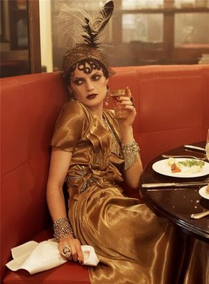
The logic applies similarly to the websites that we visit, the stores we shop at, the movies we watch, the magazines we read, the food we eat, etc... Hence, this is a compilation of the stores, blogs, magazines, and artists which inspire me. Combined, they represent my passion for design, preppy clothing, older times, Europe, and even my decision to become a vegetarian. My favorite sites would have to be the two Vogue shoots; they capture a sense of almost everything I love: the 1920's, travel, glamour, and design. The photographs emanate a dream-like quality in which it is easy to lose myself. Each frame causes the eye to constantly move around the photograph, never resting in one spot, allowing the narrative of the entire shoot to come alive.


Vogue March 2011


Vogue September 2007