Thursday, August 30, 2012

Shaping my world

Structural lines.


Though lines are used to create visual order, one can not forget that they play a huge role in architecture as well. Structural lines are those that give support to a design. These buildings and the crane emphasize their structural lines through repetition and strong grids to create a pleasing aesthetic as well.

Notice the image on the bottom left uses the Rule of Thirds to create good composition. If one drew a tic-tac-toe board over any design, where the lines cross is the best place the focal point because it aligns with the Golden Mean -- ratios used to create beauty. Placing an object in the center of a design is expected, which is why generally it is better to use the Rule of Thirds to create a strong composition.
Points.

Four of the above images use the Rule of Thirds to create a focal point. However, points can also be used to create balance and unity as in the photos in the middle row and the photo on the top left.

Vertical and Horizontal lines.

Horizontal and vertical lines, though they establish different objectives on their own, can work together to create order within a space, as seen in the woven back of a chair. The horizontal lines of the blinds (top left) have a calming effect, while vertical lines are used to draw the eye up and evoke a sense of stability and power. The long verticals of the windows give the building a sense of authority and prestige.


Diagonal lines.

Diagonals are used in design to create movement and a sense of energy and action. For instance, your eyes are drawn automatically to my self-portrait on the top right. Whether you realized it or not, your eyes were directed there by the diagonals from the pieces to the left and below. The diagonal cross hatching within the self portrait itself give the image a dynamic quality.
Organic lines.
Organic lines can give the eye a break from the stiffness that vertical, horizontal, and even diagonal lines can create. Like diagonal lines, organic lines create a sense of movement, but they also have a whimsical quality as well. Organic lines are often found in nature, such as the wave inspired architectural design (top). The organic lines on the vintage car give off an impression of speed, while the entire vehicle uses elegant lines and shapes to produce a sense of glamour.

Implied lines.

 Implied lines occur when the eye makes the visual leap between to separate objects, and connects them. The holes within the pink fabric and the gaps within the architecture create implied lines through the contrast in value and medium. When backlighting is used within a photograph, it also creates implied lines through the formation of a blunt profile. Though there are gaps between the letters in the sign, the eye automatically makes the jump and visually "connects the dots."

I similar trick was used by impressionists painters to blend color. Van Gogh did not blend is backgrounds so that the gradations between colors were seamless. Instead, he put bold colors right next to each other, causing the viewer to mix the two visually from a distance.


Geometric shapes.
 Geometric shapes have been used for centuries in design to create intricate patterns or give the illusion of texture. Geometric patterns can add an element of refinement and elegance or they can be used to make a space more modern. Geometric shapes are found in almost every object we come across that is man-made. The bicycle at the top of the collage is an excellent example of how shapes are used in engineering as well.

Organic shapes.

Organic shapes can be found anywhere in nature and are considered by some to be the most beautiful. Like organic lines, they give off a sense of freedom -- they can be both alive and alleviating.

Abstract shapes.

Though abstract shapes are not realistic, they are representative of the form they are trying to suggest and generally recognizable. Abstract shapes, often inspired by nature, can create beautiful patterns and textures for fashion, textiles, and artwork.

Non-representational shapes.

Non-representational shapes are unrecognizable as a specific form; it is because of this that many non-representational designs are over-looked or regarded as unattractive. Most people tend to not like the things that they don't understand. Learning about the elements and principles of art however, can give anyone the tools to analyze and possibly appreciate non-representational designs. It is often more difficult to make a good piece non-representational art that incorporates several elements and principles of design. Non-representational design causes the viewer to think more critically as well. After all, if everyone liked a  designer's work than they must be doing something wrong -- nothing is interesting if everyone likes it.


Wednesday, August 22, 2012

“Beauty has a lot to do with character.” - Kevyn Aucoin


Beauty is often times what we make of it. Though there are many standards of what is beautiful, a memory, history, politics, and even ignorance can color one’s perception of beauty. Our own past and predispositions have a remarkable affect on our ability to view the aesthetic quality of an object objectively. However, everyone should work to expand their definition of what is beautiful; by actively seeking to understand and see things from a novel perspective, we are rewarded by innumerable opportunities to learn and grow. Each time we push our boundaries, we are increasing are ability to be more fulfilled in life.

Monet’s Charing Cross Bridge is an example of something that I think, and most people would probably agree, is incredibly beautiful. I in particular, love Impression and am therefore more inclined to favor Monet’s work. However, Monet’s use of color, texture, movement, and unity are some of the qualities which make his work undeniably beautiful.

Monet's Charing Cross Bridge, 1899


There is a section in East Campus at the University of Georgia that I have always thought was extremely ugly. There lies a coal plant, complete with mounds of coal, a coal-fired boiler, lots of pipping, and smoke rising into the air. It takes away from what I would mostly otherwise consider, an attractive (and in some places beautiful) campus. Not only is the area itself repelling, but its representation of our dependence on fossil fuels only adds to its gloomy nature. Recently, however, I have started thinking that photographs of the area would be interesting in the very least, if not beautiful. I decided to take a picture of the scene and convert it to black and white. Objectively, I do see some beauty in the photograph itself; there is good use of line, composition, movement, and contrasting values. However, I have come to find the concept of a series of similar photographs quite beautiful. Bringing attention to our environmentally damaging practices is beautiful in and of itself.

UGA's coal-fired electric plant.


Mattias Klum, a photographer for National Geographic, uses his own photographs for the same purpose. Through his gorgeous photographs he hopes to inspire a compassion for nature within people’s hearts, hoping this compassion will then connect to their minds and affect their practices.


Mattias Klum's photographs from National Geographic.

Inspiring Designers


The designers that I admire each use relatively neutral colors in order to anchor their designs, allowing the furniture and fabrics within the rooms to become a focal point. While there is a range from antique to contemporary elements within the space, neither style dominates the other. Though sophisticated and classic, the spaces are also interrupted by bursts of contrasting colors and textures. Each of the spaces evokes an air of finesse, yet they are still warm and inviting. 

One of my favorite designers is Nate Berkus. He is able to create a space that feels relaxed and elegant at the same time. He is incredible at mixing eclectic pieces to create a cohesive style and mood within a room. Nate is also a huge believer that a home should reflect a person’s lifestyle and interests; he is able to add those personal details which makes each habitant feel that their room belongs to them.

Nate Berkus designs.
from: annesage.com

Nate Berkus design.
from: blackinkinteriors.blogspot.com

Tuesday, August 21, 2012

The Whole is Greater than the Sum of its Parts


"You are the average of the five people you spend the most time with." -Jim Rohn

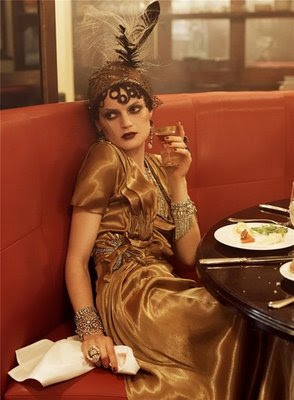
The logic applies similarly to the websites that we visit, the stores we shop at, the movies we watch, the magazines we read, the food we eat, etc... Hence, this is a compilation of the stores, blogs, magazines, and artists which inspire me. Combined, they represent my passion for design, preppy clothing, older times, Europe, and even my decision to become a vegetarian. My favorite sites would have to be the two Vogue shoots; they capture a sense of almost everything I love: the 1920's, travel, glamour, and design. The photographs emanate a dream-like quality in which it is easy to lose myself. Each frame causes the eye to constantly move around the photograph, never resting in one spot, allowing the narrative of the entire shoot to come alive.


Vogue March 2011


Vogue September 2007


Thursday, August 16, 2012

What is my style?


Classic, neutral, and laid-back with a touch of glamour--such as the petite chandelier hanging in the bathroom. Clean and neutral palettes allow a space to transform with a pop of color or an unexpected piece of furniture. Mixing antiques with modern furniture in a contemporary way keeps a space from feeling too outdated or avant-garde. A home should feel lived-in and relaxed--not like living in a museum. It should reflect your travels and interests, from the mosaic lamp you found in Mexico to the books on your shelf. A space should also take into account the surrounding environment through sustainable practices and design.

My approach to fashion is much like my interior preferences. I lean on the preppy side and love classic and tailored pieces. However, I also like to mix in some bohemian or vintage pieces which elicit a relaxed or luxe effect. I buy very few labels because anyone can dress well on a low budget--that’s just part of the creative problem solving that comes with being a designer as well.
The Kate Spade logo.

Wednesday, August 15, 2012

What is Interior Design?


An abstract watercolor painting of mine from 2007.
Representative of my style- I love the stimulating color and movement of the lines.
Interior Design is the planning of a space so that it accomplishes a particular aesthetic and function. Every design is meant to evoke a certain concept or feeling, whether that is warm and inviting, or cool and relaxing. However, not all spaces are supposed to convey a comfortable atmosphere; some spaces may even be designed to make you feel sad, such as a commemorative exhibit of 9/11, and even others may be designed to make you want to leave quickly--there’s a reason all fast food restaurants use overly bright lighting and primary color schemes.

Each space is a narrative; it is a reflection of the designer and client. Each object, color, and chosen fabric layer upon each other to create the final product--these choices denote the designers interests, experiences, and attitudes which ultimately culminate to develop the designer’s style. Interior design is a reflection of many inspirations that include architecture, fashion and art, which are themselves influenced by history and modern day issues. It is a constantly evolving art form that pushes designers to solve problems and come up with innovative and creative designs every time they approach a project, adapting their style and allowing it to resonate through each challenge.